Image, Style, and a Return to Blogging, Part 2
My last post, Image, Style, and a Return to Blogging, Part 1, was supposed to be one post encompassing two intertwined topics, however things ran a bit long. Part two of my ramblings on photographer branding and image is now upon us.
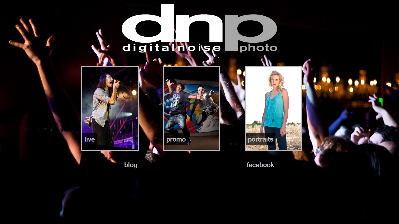
Last time, I talked about my portfolio redesign and how I wanted a certain image to come from it. That image being a slick, clean, and straight-forward presentation of my work, and therefore my “philosophy” about my work, I guess you could say. Throughout various redesigns of my website, one thing has always been constant: a clean, simplistic design that puts the images in the forefront, while not cluttering up the blog design with unnecessary flourish. That said, the current blog theme that I’m running is the most removed from this concept, however I justified that to myself because the portfolio is picking up the slack. The images are the most important aspect of this site, and therefore I want them to stand out, and to not have anything interfere with the viewing of said image. The portfolio design accomplishes this, while the blog takes over the role of looking “fancy”. Although the current blog layout is still fairly clean, it’s just got a bunch more polish and modernism than previous designs. It still gets my image across though, for the most part. The blog theme may end up getting switched out within the next year, who knows.
Image and Style As A Photographer
Graphic Watermarks
That brings us to the point of this post. Image. No, not your photos, but your “brand image.” Personally, as I stated above, I’ve always opted for something clean, sleek, and fairly modern yet cannot be dated too terribly easily. Look at the image at the top of this blog (yes, the same one I used in the last post–creative, no? 😀 ). I’ve been using this logo for several years now. It’s clean, scales well, and recognizable. It’s just very simple, and I designed it myself a good long while ago. I could probably get something better if I paid a design pro, but I like what I’ve got now, and it works for me.

The image above shows my current watermark. I’ve been using this watermark for about a year now. Again, it sticks to my theme of being sleek, clean, and unobtrusive. I’d probably consider this my “third generation” of watermarks. I went with this concept for a watermark because it doesn’t interfere with the image at all under 99.99% of photos, and it looks great. Yeah, it’s easy to crop out, however believe it or not this watermark actually gets cropped out less often than previous incarnations.

You’ll notice that both the promo photo and this Napa landscape have identical logos as the watermark. Which one looks better though? Which one looks more clean and professional? My opinion, obviously, is the “task bar” watermark. It stays out of the way, whereas the larger DNP logo just sticks out. It grabs my eye in an unpleasant way. Going back to the cropping of watermarks, when I make photos available on Facebook for people, this watermark got cropped out like CRAZY. Not cool for people to do when you’re providing them images for sure, but even worse, they were ruining my images, which I’d already cropped/framed into a certain composition. I initially stopped watermarking images, but then designed the current task bar watermark, and I’ve seen crop instances drop dramatically from the previous larger logo.

However, logo watermarks can definitely work when done tactfully. My buddy Marco Malek has a really great logo for his work. It’s up there out of the way, yet visible, and doesn’t distract from the image it’s on. The difference between this logo and my second gen logo is readily apparent. In my opinion, more noticeable isn’t necessarily a good thing. Marco’s watermark is just noticeable enough without being annoying, like mine was.
Text watermarks
Remember how I said that the current mark is a “third generation” in my watermarks? Well, the larger logo was my “second generation”, with my first generation just being a text watermark, at first with my own name, and then with the digitalnoise|photo name, both with a copyright symbol. I used clean fonts for this, typically the Myriad Pro font. I’ve been using this font for many years now, it’s one of the cleanest fonts I can choose. I use it in my logo in the above examples (albeit stretched a bit), as well as the digitalnoise|photo header image on this blog, among countless other examples. Either way, I just have always felt that using a plain text watermark didn’t communicate the image I had wanted to be put out. It works for some people, just not for me.
But there’s a danger with using just text watermarks. That danger is font choice. I chose a clean, san-serif font because that’s what I would like my brand image to be. Some people use more fancy, script-like or handwritten fonts, and it works for them. But some people choose to go with big, bulky fonts, or cliched abysmal choices (like Comic Sans haha), and it just looks, well… Abysmal. And most certainly not professional. I was going to mock up some of these “good” and “bad” examples, but, looks like with the exception of Comic Sans, I don’t have any fonts on this computer that would really illustrate my points too well. And I’m sure not going to call out people I know as having poor examples of watermarks. That’s just tacky. So, I’ll hope that you know what I’m referring to here.
If you insist on using a plain text watermark with your name/studio name, keep it simple, keep it clean, and keep it simple. Choose a great font (note: great doesn’t mean overly fancy). Don’t curve the text, don’t throw a billion Text Layer Blending options on it in Photoshop. Make sure it’s easily visible and legible. You nail all of those, your text watermark will work quite well!
Large Semi-Opaque Watermarks
Some people eschew the tactful use of watermarks completely. Ross Halfin does this with a very large, detailed, circular logo, and at first it highly irritated me. But then I gave it some thought. Ross has timeless, priceless photos of some of the most iconic rock gods of our times. I can understand his desire to protect the use of his images, as he sells these images for some pretty good money, and shoots for some very high profile clients. And while the logo is obtrusive to a point, it’s not that big of a deal in his grand scheme of things, to a point. That said, I don’t like it. Unless you have a legitimate financial reason for protecting your images so very fiercely, I just can’t justify this option.
But some people do. Some people feel that protection of their work is more important than the work itself. Most people don’t really have to worry about this, in my personal opinion. It just detracts from the image, and most of the time makes it not fun to view the images.
So, What Should You Not Do?
That’s a huge list that I’ll never comprehensively cover. Regarding watermarks and branding, however, here’s a start:
- Overly fancy fonts
- Unpolished logos
- Logos that look like bad clip-art. How do you know if it’s bad clip-art? ALL clip-art is bad.
- Text/logos that are stretched out of proportion
- Logos that obscure the viewer from actually viewing the image
- Comic Sans
- Fonts that aren’t even legible
- Overprocessing text watermarks with a ton of Photoshop effects
- “Fancy” borders on your image (you know, like those “photo frames”?)
- Overly colored text/logos
That’s just a brief list, but it’s a good one. You can actually get a great idea of what not to do just by looking through the posted images at You Are Not A Photographer. In addition to being less-than-mediocre photographers, they’re usually adorned by less-than-mediocre watermarks, logos, and other accoutrements.
Why Should I Listen To You? And What Does This All Mean?
Easy, you don’t have to. I’m not the best, nor the most successful photographer out there. Obviously. The Google Analytics stats on the traffic to my blog will point that one out on its own haha! That said, I’ve been working in creative fields for quite a long while. I’ve worked as a web designer and graphic designer. I’ve been running websites and blogs since high school in the 90s. While not everything I’ve ever created or designed has been elegant, I’ve learned along the way. I’ve refined my creative tastes and process through my trials and errors. I’ve learned that most everything I design is clean, crisp, and sleek. I’ve learned that certain fads are just that. Remember the Web 2.0 craze? Yeah, exactly haha.
With that, I’m not claiming to be an expert, I just like to think that I know what looks good, and what doesn’t. I have my tastes and preferences, just as all of you do, and everyone’s a bit different. Some people are very specific and picky on their ideas and tastes, others are the exact opposite, almost not caring. I’m hoping that I can help people realize some things about their branding, image, and style. Perhaps help them improve their business.
Basically, what I’m trying to illustrate here is that there are certain truths within all aspects of visual art and design. These truths are that certain things just look bad. They make your brand look bad. They make you look less respectable or competent than everyone else vying for business in your overcrowded, oversaturated market (oh, and it is). It’s incredibly easy to turn your image around by starting with making sure that certain elements of your brand are clean and professional.
Make sure your portfolio is clean (as mentioned in the last post). Make sure your images have clean and clear watermarks that don’t interfere with the photo. Hopefully all of your branding is consistent across your different marketing elements (I think I’ll get into this, along with more website thoughts, later in another post, actually).
But most of all. Most importantly. None of this means absolutely anything if your photography isn’t there. The best logo and portfolio design in the world won’t save you if your photos aren’t up to par. Remember that, and always strive to get better.
Post-Mortem
I wasn’t exactly sure where this post would meander, but I think it covered some good info. I didn’t hit everything I wanted to, but I went into more detail in what I did hit on than I was initially expecting. Eh, I never said I was a great writer, did I? 😀
I do want to get further into some detail with regards to website design, and Facebook. That’s a huge one with me right now – Facebook etiquette and content behavior. And I don’t think I’m going to necessarily restrict that to photographers, because there’s most certainly plenty of small businesses or professionals that I believe really could learn how to make themselves look more professional with only a few changes.
But that will be for a later post…


2 thoughts on “Image, Style, and a Return to Blogging, Part 2”